The Basics of Color

Ever wondered about the basics of color? This will give you a bit of background on color schemes, color for screens, color in accessibility, and color meaning.
Color schemes
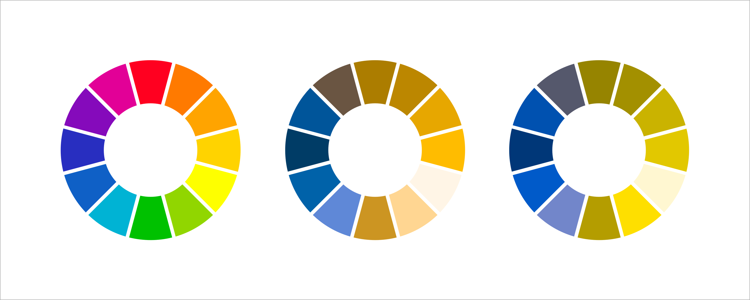
If you’ve ever taken an art class, you’re probably familiar with the color wheel. The color wheel is composed of three primary colors—red, yellow, and blue—that are hues that cannot be composed by blending other colors together. In between each primary color on the color wheel are secondary colors: the result of blending the primary hues on either side together.

Blending adjacent colors can be extended infinitely to form more colors; secondary and primary colors yields tertiary colors, and so forth.

Colors can be considered cool or warm. Blues, greens, and purples are cool and tend to be calming or soothing. Reds, oranges, and yellows are vivid and bring brightness and energy. White, black, and grey are considered neutrals.
When choosing colors, besides “what looks good,” consider the following color schemes:
Complementary
Colors at opposite sides of the wheel are considered complementary colors, as polar opposites, they produce high contrast and vibrancy. As an example, think of holiday red and greens or how common yellow and purple are on sports teams.

Blending complementary colors produces neutrals; at the highest point of contrast; they cancel each other out.
Split complementary
A variation on complementary colors takes a single on the wheel and instead of pairing the complement directly across, uses the two colors adjacent to that complement.

Analogous
Colors adjacent to each other on the color wheel are considered analogous colors. These are most common to what is found in nature.

Triadic
A set of three colors spaced evenly around the color wheel is a triadic color scheme.

Tetradic
Similar to a triadic color scheme, the tetradic or rectangular color scheme uses four colors arranged into two complementary pairs, which could be squares or rectangles.


Tints, shades, and tones
Additionally, by adding white, black, or grey to a pure hue, tints, shades and tones can be created.

Color in context
Already, with all these schemes and variation, there are limitless schemes and variations. Making color decisions goes beyond picking a scheme or a palette. Context matters too; that is, the perception of a color changes based on the colors surrounding it. We might say a color reads more blue or reads more green within context. Colors also can create a vibrating “line” with high intensity contrast.

Color for screens
Color on screens is much different than color for print.
If you’ve worked as a print designer, you’re probably intimately familiar with the CMYK printing process. Print production uses a 4-color process that combines cyan, magenta, yellow, and black ink to layer small dots over each other. While now a standard inkjet printer can lay the four colors simultaneously, in printing press days, a printer would need to lay a single plate with a single color at a time for all four colors. Black is represented as K for “key” because in plate printing, the three additional colors were carefully registered or aligned with the black key plate.
In the CMYK process, as colors are added to to each other, darker colors result, ultimately ending in black. This is a subtractive process, because as inks are combined, they reduce the light that would otherwise be reflected as the paper absorbs the light; inks are subtracting brightness from white.
Print production can also take advantage of PMS—the Pantone Matching System®, which is a proprietary color space. The PMS uses pre-determined, published color formulas to create standardized ink colors that are precise and consistent. This is often referred to as spot color.
When designing for print, it is important to work in CMYK files and to proof printed work prior to final production.

Computer screens emit RGB—red, green, and blue—light, which are the primary color lights. RGB is an additive process; the addition of colors ultimately result in white, the purest of color. This is based off of human perception of light. Zero color intensity results in black (think of a blank or turned off screen). While RGB can create all colors of the visible spectrum, screens are limited with the gamut of colors they can reproduce.
When designing for web or device screens, it’s important to remember that monitor color and screen resolutions can affect color output.
Accessibility
It’s important to consider accessibility when making color decisions. Color blindness affects 1 in 12 men and 1 in 200 women in the world. Red and green colors commonly present visual problems, but blue and yellow and monochromatic schemes can be difficult for someone with color blindness to differentiate as well. While this can be offset with additional visual cues, there are many tools to simulate color blindness during the design process, allowing you as the designer to make intentional decisions about color.
Color meaning
Lastly, color decisions should be made about what works for the brand, and context is a big part to be considered here. Think back to those adjectives you used to describe the apps earlier: bright, formal, and inviting, or serious, calming, playful, inspiring, bold, discreet, etc. Colors evoke feelings. Would an experience that tracks medication intake warrant the same color scheme as an experience that helps people send expressive photos back and forth?
Consider color meaning. Red in design, for example, is commonly used in error patterns. It says you’re wrong; you made a mistake. But beyond that, red is brilliant and bold. It in Western cultures has associations with power, passion, and energy and can be physically stimulating: increasing blood pressure and metabolism. In Asian cultures particularly, red symbolizes luck, joy, and prosperity. However, in South Africa, red is associated with mourning. Consider your audience while choosing colors; their perception will influence how meaning is extracted.